GENUS MASTERING STUDIO
identity
Summary
Logotype conception and identity system concept for an upcoming music production studio.
Deliverables
Logotype
Identity system
Date
2025
Design fundementals
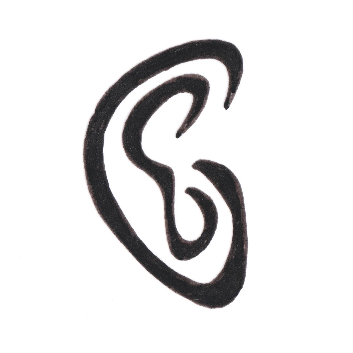
Logotype
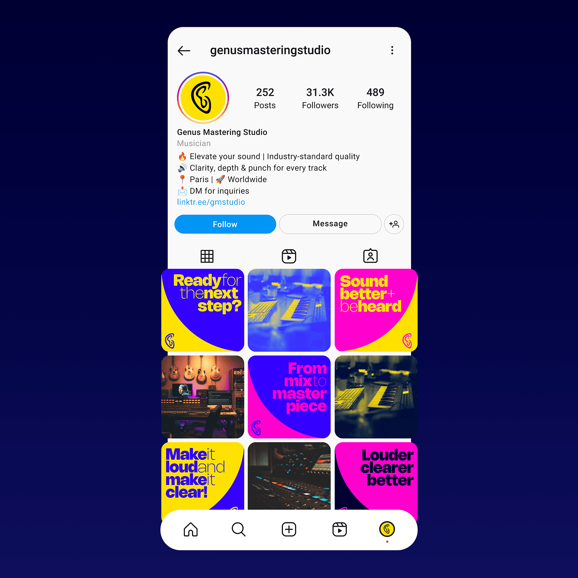
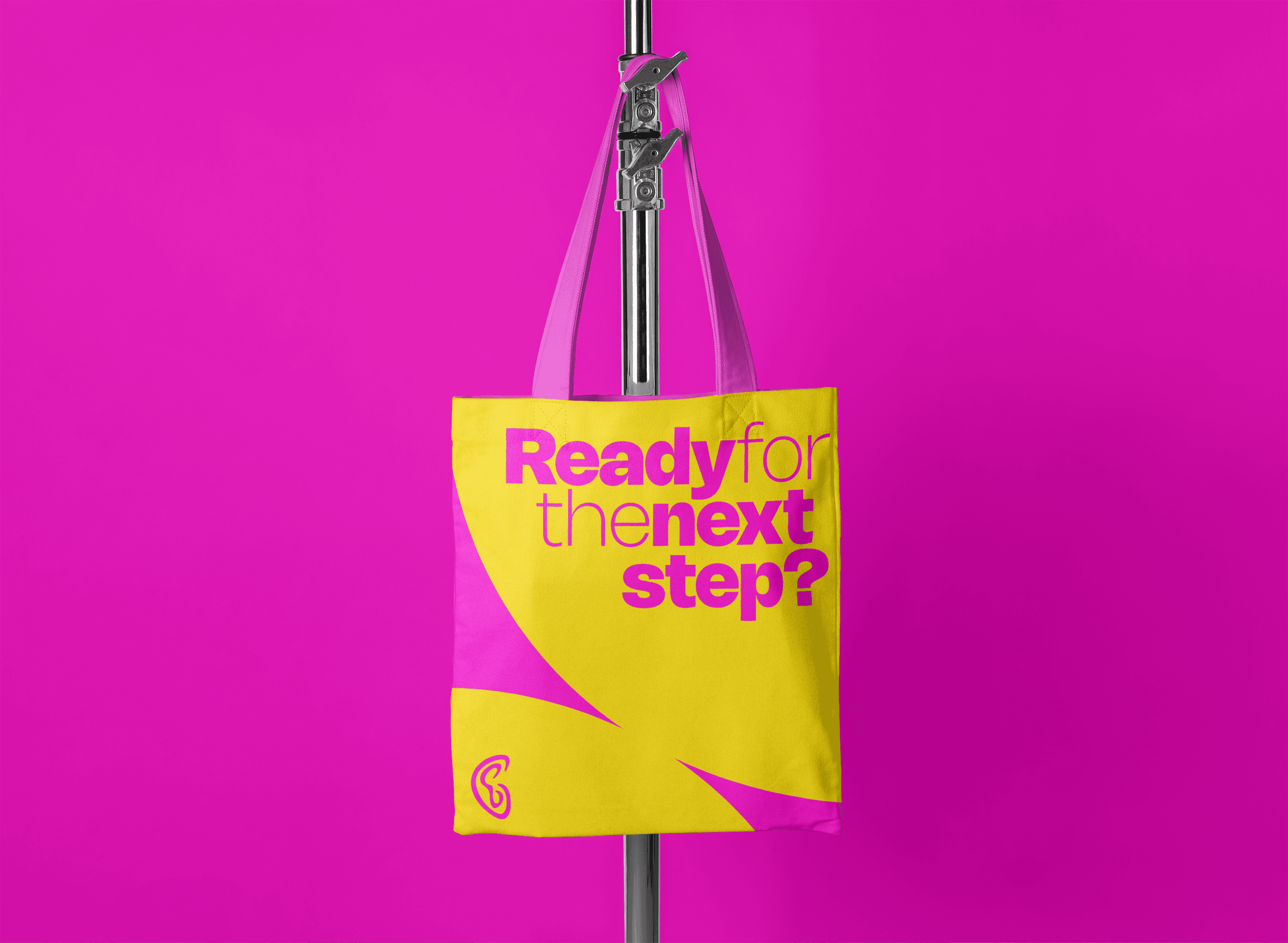
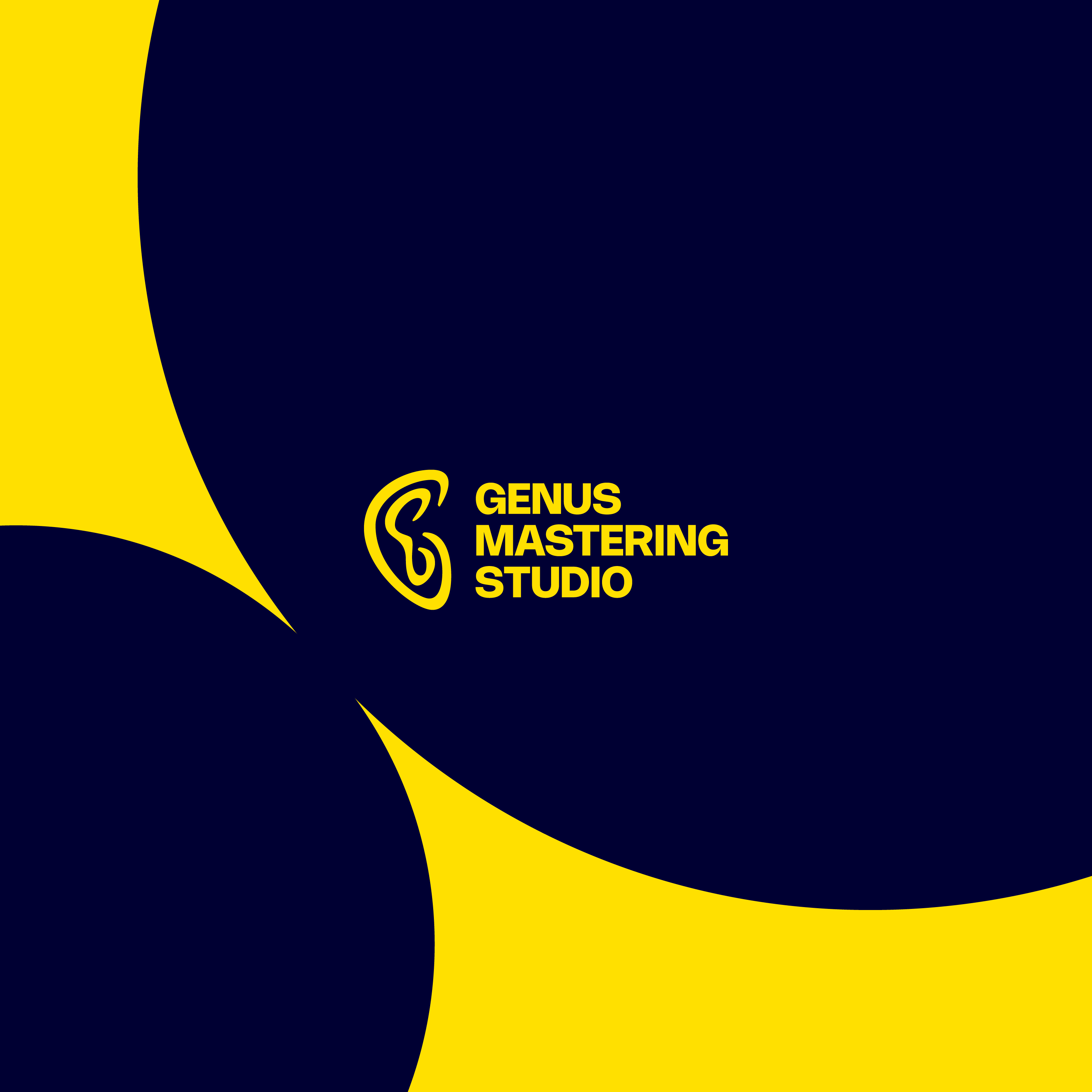
The project started as a logotype concept. The client wanted an identifiable and flexible symbol that would present a stylised G intertwined with an ear. The symbol needed to be simple in its shape and work with multiple colour combinations.


Design fundementals
Colour
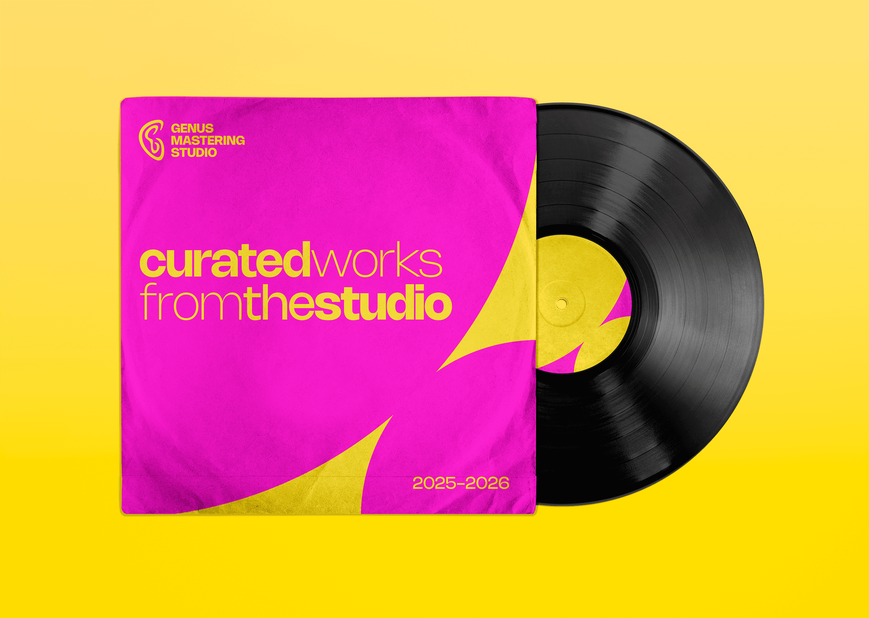
The colour palette is based on rhythm and harmony, echoing musical theory and feeling. Four colours make up the palette and each illustration or representation of the brand uses two contrasting colours for a duotone composition.
Design fundementals
Typography
Genus' main typeface is Rajesh Rajput's Nohemi. With a strong emphasis on geometric shapes and well distributed weights, the type never feels still or dull, it's everchanging, dancing and playful.

Design fundementals
Shapes
The environnement of the Genus brand is made out of two interconnected disks. They can represent the product onto which music is pressed or burnt but also the exchange and human interaction that occurs when creating or producing music.